
Color blocking in fashion is a fun and easy way to add personality and uniqueness to your look while still looking approachable. It’s a great way to say “welcome spring” and add color to your everyday life, but there are some secrets and tricks you need to know before you try it, so that you don’t look like you just escaped out of a children’s party. If you want to learn more about the color blocking rules and how to do it, keep reading!
…But, first what is color blocking?
It is a term that is commonly used in fashion and it’s about combining several solid colors in a single outfit. Usually, prints and patterns are not used because they can steal away the “blocking” effect. Many believe that Piet Mondrian was the one who inspired the color blocking trend. In fact, Yves Saint Laurent inspired by Mondrian’s artwork created this iconic Mondrian shift dress and introduced color blocking in fashion, which I’m sure many of you fashion freaks have seen before. I had the chance to see this dress in Rijksmuseum in Amsterdam and I took a picture of it, which you can see below. Also, when hearing the term color blocking Andy Warhol and pop art come in our minds too. I could talk forever about the origins and history of color blocking, however, I’m not going to bore you anymore, so back to the fun part now. 😛

Why color blocking?
Most importantly, because the prosses of creating it is fun. Secondly, it makes you look trendy and gives that fashionista vibe, without looking snobby and unapproachable. Also, it has body slimming effects when brights are combined with dark colors and darks are strategically placed in parts where they flatter the body, whereas other trends and styles don’t provide such a benefit. So since we covered all the basics let’s talk about the proper way to do it!
“How-to” Color Blocking in Fashion
Color blocking is not about throwing and combining just any color into an outfit. It has some very specific rules that are centered around the color theory. I’m not going to go there and start an endless discussion on the field, it’s just enough to know that all you really need is a color wheel. A successful color blocking is considered the one with the combination of colors that are either opposed to the color wheel (complementary), next to each other (analogous) or two or three that are each tree spaces apart (triadic).
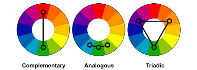
Of course, after you become an expert to the color blocking technique, you can do a lot more like the split complementary, the tetradic, two complementary with an analogous, the rectangle etc.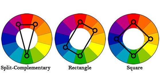
As seen on the color wheel above, the Complementary combination is a high contrasting one and it takes some confidence to wear it. However, it’s the easiest to create compared to the other two, and as a result perfect for a color blocking beginner. The Analogous combo is more harmonious and it’s considered chic and classy. It’s almost like a monochromatic look and if you have read previous posts of mine you know how I feel about monochromatic looks. Lastly, the most fun and interesting color scheme, in my opinion, is the Triadic, because you combine 3 contrasting shades that somehow look good together and seem like you spent an eternity pairing them, whereas all you really did was taking a look at the color wheel.
Don’t know where to start? Here are some combinations of each category to get you inspired:
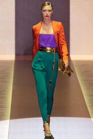
Complementary
As it’s implied in the name, these colors compliment each other the most. They are the boldest of the color combinations, so if you are feeling a bit unsure wear one color and have the other to an accessory.

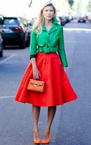

Source: Picture 1, Picture 2, Picture 3
Analogous
This combination is the most harmonious as I mentioned before. Monochromatic looks fall under this category too, but you can also mix shades, tones and tints of different colors that are next to each other on the color wheel. Usually, when we go for this color combination one of the colors is supposed to be dominant while the others act like support.
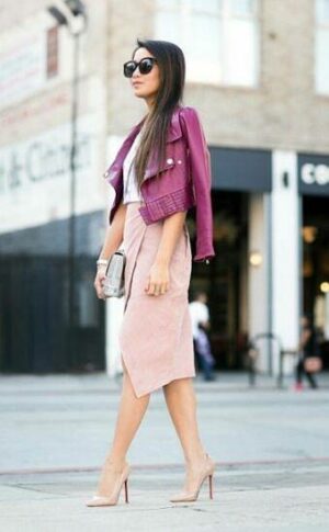
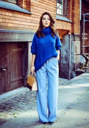

Source: Picture 1, Picture 2, Picture 3
Triadic
Because of their placement on the color wheel, the triadic color blocking tends to be very vibrant. That’s why it’s also advisable to have a dominant color and the other two to be toned down. Not that if done correctly it can’t look great though!
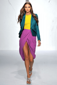

Source: Picture 1, Picture 2, Picture 3
You know I’m a strict believer in the freedom of creativity, however, there are some more rules that need to be followed if you are aiming to recreate a certain trend like the color blocking in fashion.
The Do’s and Don’t’s
+ When you are feeling unsure if the combination you created looks good, take a look at the color wheel. It never lies.
+ You don’t know with which color to start color blocking? Choose one that is flattering to your skin tone and continue from there.
+ For a toned-down color-blocked look wear brights with neutrals or have a vibrant color and others that are less saturated.
– Avoid prints. They steal away the blocking effect.
– Don’t overdo it. Go for 2 or 3 different colors. The maximum is 4, but if you are a color-blocking beginner just stick to 2 for a while.
My Color Blocking Outfit
Spring will be very soon here, so I wanted to give a proper welcome by wearing bright and fun colors. And yellow is one of them. I’ve never felt more inspired to wear this yellow knit till now and I couldn’t be more pleased with how it turned out. As you can see, I went for the analogous color combination by having two colors that are next to each other on the color wheel and my all-time favorite neutrals black and white. Of course, this look couldn’t be complete without the matching background, which I realized it looked good after I started shooting (I know, I know…very smart, but cut me some slack. I can’t even see what’s in front of me since I’m usually nervous because of the people that stare while my blog pictures are taken 😛 ).
So, what’s your opinion of the result? Would you like to copy it? If yes, I got you covered. Here are the details:
Coat: MaxMara
Shirt: Stradivarius
Knit gifted
Shorts: Toi & Moi
Bag: Michael Kors
Shoes: Sante


No matter the color blocking scheme you go for, don’t forget to have fun, take risks and make a lot of mistakes. Then, repeat the process all over again! I hope this post gave you some ideas! Don’t forget to tag me to your Instagram pics if you ever recreate or get inspired by any of my looks!
I hope to see you in the next post! <3

Kate, I never realized that there was a term for matching colors in fashion. I love the outfit that you are wearing with the analogous color combination as they go very well together and complement you. The yellow really makes your outfit pop!
I tend to do more of the complimentary combination in my own style, but when I can, I go for the triadic as I love the vibrant colors and it always make me feel good to wear them. It is fun to put bright colors together just to see how they will look in an outfit and you are right, you will make mistakes but it is all the fun working the colors together!
Do you have other favorite colors that you like to put together?
Great post! Donna
Author
Hello dear Donna!
I like it when I see complementary combinations on others, but I admit that I’m pretty hesitant to do them myself, so I rarely go for it. Lately I’ve seen red paired with pink a lot and I admit I’m starting to enjoy it even though it was a big “No” in my fashion rules in the past.
I really enjoyed reading your post. I have to admit that I had no clue about existence of the colour blocking wheels! These are so handy, I’m sure I will be using them a lot from now. Thank you for sharing such a fantastic post xx
http://www.elegantduchess.com
Author
So glad my post gave you some tips you didn’t know before! You should definitely use the color wheel when in doubt because it can never go wrong!
Great post!
I wasn’t aware of a technique called colour blocking. OMG!
Because I’m not bold enough to mix and match my colours, I stick to neutral colours. Usually the black, white and grey – which can get a bit boring.
Now Spring is on the way, I will check out the colour blocking wheel.
Where can I source one of these from?
Also, being a woman of colour do you think certain colours should be avoided by me, as they won’t sparkle as well as others?
I look forward to your response.
Thanks
Jackie
Author
Hi Jacqueline!
You can just print it, have it on your smartphone or buy one from a craft store.
To be honest, I like almost every color on dark skin tones, so I wouldn’t recommend avoiding any. Especially the vibrant ones look bomb in my opinion! Thank you for stopping by!
Hi Kate,
Thanks for your response.
Time to sort out my Spring wardrobe!
Regards
Author
I think it’s time too! I’ve slowly started sorting mine. If you need any help on how to get it ready for spring I have a post here that might help. Also, in case you were wondering which are the current trends, I have made a list of them. Feel free to comment for any thoughts or questions you may have!
xoxo <3
Kate